17 Business Dashboard Examples That Drove Proven Results in 2025

Are you finding it hard to understand your business data? The right Business Dashboard Examples can change how you track performance and accelerate growth.
Our team has built over 1,000 KPI dashboards. We’ve seen how they convert complex data into clear visuals. A well-designed performance dashboard does more than look good, it’s a vital asset that turns raw numbers into a clear, useful story about your business’s health.
Executive dashboards shine at bringing together key performance indicators from departments of all sizes into one unified view. Power BI offers advanced features that let you transform data, cooperate at scale, and set up detailed access controls.
The biggest advantage? Real-time insights help you make smart decisions and catch problems before they grow. Your business can track vital metrics like Net Income, Overheads, Total Assets, and Liabilities all in one place.
This piece will explore 17 business dashboard examples that have produced measurable results, helping you find the perfect solution for your needs in 2025.
- QuickBooks P&L Dashboard
- Cash Flow Power BI Dashboard
- Sales Analytics and Performance Dashboard
- Operational Expenses Dashboard
- HubSpot Revenue KPI Dashboard
- LinkedIn Ads Dashboard
- Zoom Call Analysis Dashboard
- Task Tracker Dashboard
- Project Finance Dashboard
- Account Growth Dashboard
- Inventory Management Dashboard
- Survey Analysis Dashboard
- Event Hour Analysis Dashboard
- Microsoft Planner Dashboard
- Sales Pipeline Dashboard
- Accounting Power BI Dashboard
- Investment Portfolio Dashboard
- Comparison Table
- Conclusion
- Key Takeaways
- FAQs
QuickBooks P&L Dashboard
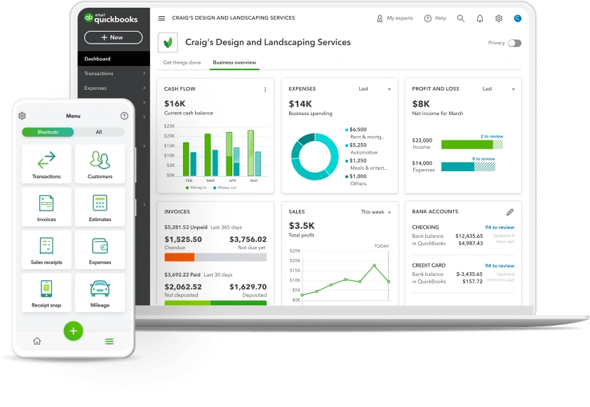
Image Source: QuickBooks – Intuit
The QuickBooks P&L Dashboard is the life-blood of financial performance analysis. It gives businesses a detailed view of their financial health. This dashboard turns complex financial data into easy-to-understand visuals that help make better strategic decisions.
QuickBooks P&L dashboard metrics
The QuickBooks P&L dashboard keeps track of key metrics that show how well a business is doing:
- Total revenue – Monitors income across multiple time periods
- Cost of goods sold (COGS) – Tracks product and service delivery costs
- Gross profit – Calculates revenue minus COGS
- Operating expenses – Details all business running costs
- Net income – Shows the bottom-line profit after all expenses
On top of that, it helps analyze profit and loss trends by comparing revenue against expenses across different timeframes, last month, month-to-date, and year-to-date. These comparisons reveal clear patterns in your financial performance.
QuickBooks P&L use case
Financial teams use this dashboard to monitor performance and analyze profitability trends. Business owners can track working capital and overall performance at a glance with live financial data. Many users love viewing P&L and budgets on their phones, which lets them keep an eye on finances from anywhere.
The dashboard helps accounting professionals turn client conversations into strategic discussions about financial health. They can move beyond just sharing numbers and focus on why certain trends exist and how to improve them.
QuickBooks P&L business impact
Many organizations have seen substantial benefits from their QuickBooks P&L dashboard. Visual representations make financial data easier to understand and speed up decision-making. The dashboard’s live updating helps businesses stay on top of critical financial changes, whether they face unexpected expenses or sudden sales increases.
Small businesses find great value in the dashboard’s features that identify profit trends, spot potential problems, and help make data-driven decisions about resources and costs. A general contractor’s success story shows how using job costing and categorizing revenue by customer led to customer-specific P&L reports. This approach helped optimize pricing strategies and boost overall profitability.
Cash Flow Power BI Dashboard
Image Source: Biz Infograph
Power BI changes how businesses monitor their finances with dynamic cash flow dashboards. These dashboards give key insights about liquidity for businesses of all sizes. Interactive visualizations unite critical financial data in an easy-to-understand format that helps make better decisions.
Cash flow dashboard metrics
A complete cash flow Power BI dashboard tracks these key financial indicators:
- Net cash flow – Monitors overall difference between inflows and outflows
- Cash inflows and outflows – Shows money movement by category
- Beginning and ending balances – Shows opening and closing cash positions
- Cash conversion cycle (CCC) – Measures time to convert investments into cash flows
- Variance analysis – Compares actual versus forecasted cash positions
- Working capital – Tracks short-term liquidity and operational funds
- Free cash flow – Measures cash generated after operational expenses
The dashboard divides cash activities into operating, investing, and financing categories. Each component gets a detailed breakdown.
Cash flow dashboard use case
Finance teams use these dashboards to keep track of their liquid assets and spending capacity. The visual platform shows the difference between cash flow and revenue streams clearly. This distinction matters because timing differences between income and expenses often create gaps between reported revenue and available funds.
CFOs and executives depend on cash flow dashboards for many reasons. They analyze short-term liquidity, track bank account balances across currencies, and make strategic financial decisions. These tools are a great way to get forecasting capabilities. Businesses can plan future cash needs and optimize their resources better.
Cash flow dashboard business impact
Companies that use Power BI cash flow dashboards see major improvements in their financial visibility and decision-making. The dashboards help businesses to:
- Spot potential cash shortfalls early
- Make better capital allocation decisions for growth
- Cut down manual work in cash flow management
- Track gains from investments, both realized and unrealized
- Learn about cash flow patterns across legal entities, currencies, and bank accounts
Advanced visualization features turn complex financial data into applicable information. Finance teams can optimize working capital while maintaining stable operations. This evidence-based approach cuts financial risks and boosts overall business performance.
Sales Analytics and Performance Dashboard
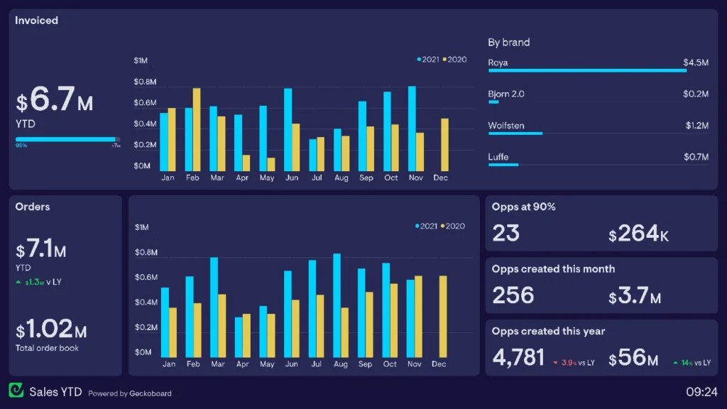
Image Source: Geckoboard
Sales teams excel when they can see their performance data through complete analytics dashboards. These powerful tools turn complex sales data into useful insights. Teams can make data-backed decisions that boost revenue growth.
Sales analytics dashboard metrics
Good sales performance dashboards track several key metrics:
- Pipeline health and coverage – Visualizes opportunities by stage, probability, and expected close date
- Quota attainment – Shows progress against targets for individuals and teams
- Conversion rates – Tracks lead-to-opportunity and quote-to-close percentages
- Sales cycle length – Measures time from first contact to closed deal
- Revenue metrics – Monitors total revenue, growth rate, and forecast accuracy
These dashboards display data through charts, heat maps, and funnel visualizations. Complex performance patterns become easy to understand.
Sales analytics dashboard use case
Sales leaders use these dashboards to monitor team performance, spot coaching chances, and make strategic decisions. The visualization tools turn number-heavy meetings into discussions about performance trends.
Sales representatives can track their pipeline and identify problems. This helps them focus their efforts based on up-to-the-minute data. Teams can stop relying on spreadsheets and use automated content creation.
Sales analytics dashboard business impact
Companies using sales analytics dashboards see substantial results. A data science company achieved 80% faster query development with Oracle’s platform and saved €31,250 yearly. Another business increased conversion rates by 21% within three months after setting up a complete customer dashboard.
Book your Business Intelligence and Reporting consultation to find how these dashboards could revolutionize your sales performance.
CRM data combined with visualization tools helps teams make faster, more accurate decisions. This leads to better forecast accuracy and optimized resource allocation.
Operational Expenses Dashboard
Image Source: Qlik
A clear view of daily business costs helps manage operating expenses better. An operational expenses dashboard works as a central place to watch, analyze, and cut costs that affect a company’s bottom line.
Operational expenses dashboard metrics
Good operational expense dashboards keep track of these key financial measures:
- Operating expenses (OpEx) – Regular costs not linked to production, such as salaries, rent, and utilities
- Expenses as percentage of revenue – Shows operational efficiency and spots when costs go beyond acceptable limits
- Expense composition – Shows spending by category to find areas where costs rise too much
- Budget vs. actuals – Looks at planned versus actual expenses to track differences
- Untagged expenses – Finds wrongly categorized spending that might throw off financial analysis
Companies that watch their equipment operations can cut runtime by up to 40%, which saves on operational costs.
Operational expenses dashboard use case
Finance teams use these dashboards to track cost efficiency and stay within budget. The visual platform helps executives spot waste, compare different sites, and stop costly breakdowns through early maintenance.
The dashboard helps companies meet their financial goals by cutting costs. These tools give live insights and let teams fix problems remotely while tracking seasonal patterns.
Operational expenses dashboard business impact
Companies using operational expense dashboards see big improvements in cost management. Equipment problems left unfixed can push energy costs up by 50% and cut system life short.
Better visibility lets businesses spot underperforming equipment and track trends to make informed decisions. This cuts unnecessary costs like emergency repairs. The dashboard turns scattered financial numbers into useful information, which leads to better resource use and increased efficiency.
HubSpot Revenue KPI Dashboard
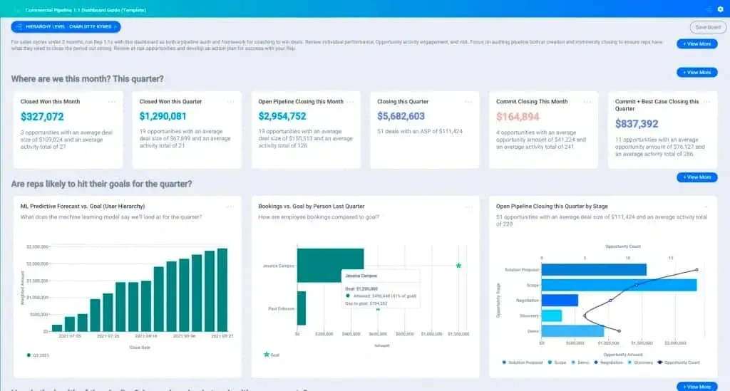
Image Source: HubSpot Blog
HubSpot’s KPI Dashboard helps businesses get a complete revenue picture by turning scattered data into useful information. The dashboard serves as a central tool that connects marketing, sales, and service data to help make better decisions.
HubSpot KPI dashboard metrics
HubSpot Revenue KPI dashboards track these key metrics:
- Revenue analytics – Track projected value over time, understanding renewals, upgrades, and churn effect
- Deal forecast – Monitor revenue by pipeline stage with probability-weighted projections
- Deal leaderboard – Rank team members by closed revenue and forecasted amounts
- Marketing qualified leads (MQLs) – Track leads generated by marketing efforts
- Sales qualified leads (SQLs) – Monitor leads qualified by the sales team
- Conversion rates – Measure percentage of leads converting to customers
HubSpot calculates new, existing, and lost recurring revenue based on deal properties and shows clear revenue trends.
HubSpot dashboard use case
Sales and marketing teams mainly use these dashboards to track performance and line up goals. Executives can make evidence-based decisions using up-to-the-minute data.
Finance teams use the dashboards to monitor revenue marketing ROI and track recurring revenue metrics. The dashboard’s customization features let businesses create tailored views for specific needs from leadership overviews to detailed team performance tracking.
HubSpot dashboard business impact
Companies using HubSpot KPI dashboards report major improvements in visibility and decision-making. These dashboards help businesses to:
- Increase efficiency by reducing manual reporting work
- Improve cooperation between sales and marketing teams
- Better line up with overall business goals
- Make faster decisions using current data
This gives businesses clearer visibility into revenue streams, which helps teams streamline processes and focus on what matters most, leading to better bottom-line results.
LinkedIn Ads Dashboard
Image Source: LinkedIn
LinkedIn’s Campaign Manager gives businesses powerful advertising analytics that turn advertising data into practical insights. This complete dashboard helps marketers measure how well their campaigns work and improve their advertising strategies.
LinkedIn Ads dashboard metrics
The LinkedIn Ads dashboard tracks several key metrics that show advertising performance:
- Impressions – Number of times ads were displayed
- Clicks – Total chargeable clicks based on campaign objectives
- CTR (Click-Through Rate) – Percentage of clicks relative to impressions
- Conversions – Actions taken after viewing or clicking ads
- Cost metrics – CPC (Cost Per Click) and CPM (Cost Per Thousand impressions)
- Key Results – Outcomes achieved based on campaign objectives
LinkedIn’s Performance Chart lets advertisers see specific metrics and compare up to eight campaigns at once. Marketers can spot trends and make improvements based on this data.
LinkedIn Ads dashboard use case
Marketing teams use this dashboard to assess campaign results for different objectives. Teams can filter campaign data, customize how they view metrics, and analyze performance by professional demographics.
The dashboard helps prevent ads from getting stale by showing frequency metrics that signal when to change campaign frequency. This visibility lets marketers make smart decisions about content, targeting, and budget allocation.
LinkedIn Ads dashboard business impact
Companies that use LinkedIn Ads dashboards see major improvements in their campaign performance. The platform helps businesses connect with over 900 million professionals using targeting options like industry, seniority, and job function.
The dashboard turns complex advertising data into clear visuals that show which companies interact most with ads. This knowledge leads to better decision-making for account-based marketing strategies. Companies can calculate ROAS (Return On Ad Spend) to check profitability and match marketing efforts with revenue results.
Zoom Call Analysis Dashboard
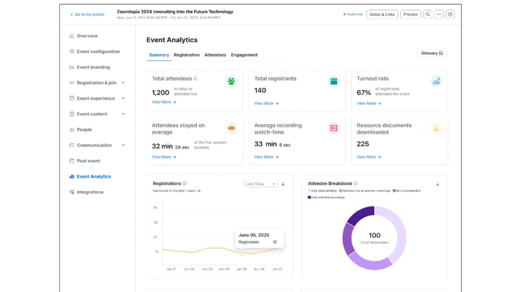
Image Source: Zoom
Organizations need to assess virtual meeting performance as they expand their remote operations. Zoom’s Call Analysis Dashboard shows important metrics through interactive visualizations. These tools help teams understand call performance, quality metrics, and how users interact during calls.
Zoom dashboard metrics
The Zoom Call Analysis Dashboard monitors these performance indicators:
- Call volume and length – Shows the number of calls and their average duration
- Average hold time – Shows unproductive waiting periods during calls
- Hour-by-hour analysis – Shows peak usage times and longest call periods
- Completion status – Shows calls by result (completed, abandoned, missed)
- Meeting quality (MOS Score) – Measures audio, video, and screen sharing quality
- User feedback – Records reported issues and room feedback scores
Teams can explore data from monthly to daily views in the dashboard. This helps them spot differences between weekday and weekend usage.
Zoom dashboard use case
Community engagement specialists use this dashboard to assess virtual event success. Call center managers use AI-first analytics to track agent performance and customer experience.
The system lets teams study call data through multiple filters, date range, call result, type, and initiator. The hour-by-hour breakdown helps spot times when hold duration peaks, which helps managers adjust staffing.
Zoom dashboard business impact
Companies that use Zoom analytics dashboards see major operational improvements. The predictive analytics help forecast call volumes so managers can plan staffing better. The easy-to-use interface gives different users access to relevant information. Agents see their own performance while executives track high-level metrics.
Better customer interactions result from these improvements. Teams can customize customer experiences based on evidence-based decisions. The customized dashboards help spot ways to improve answering rules and voicemail practices when many calls disconnect.
Task Tracker Dashboard
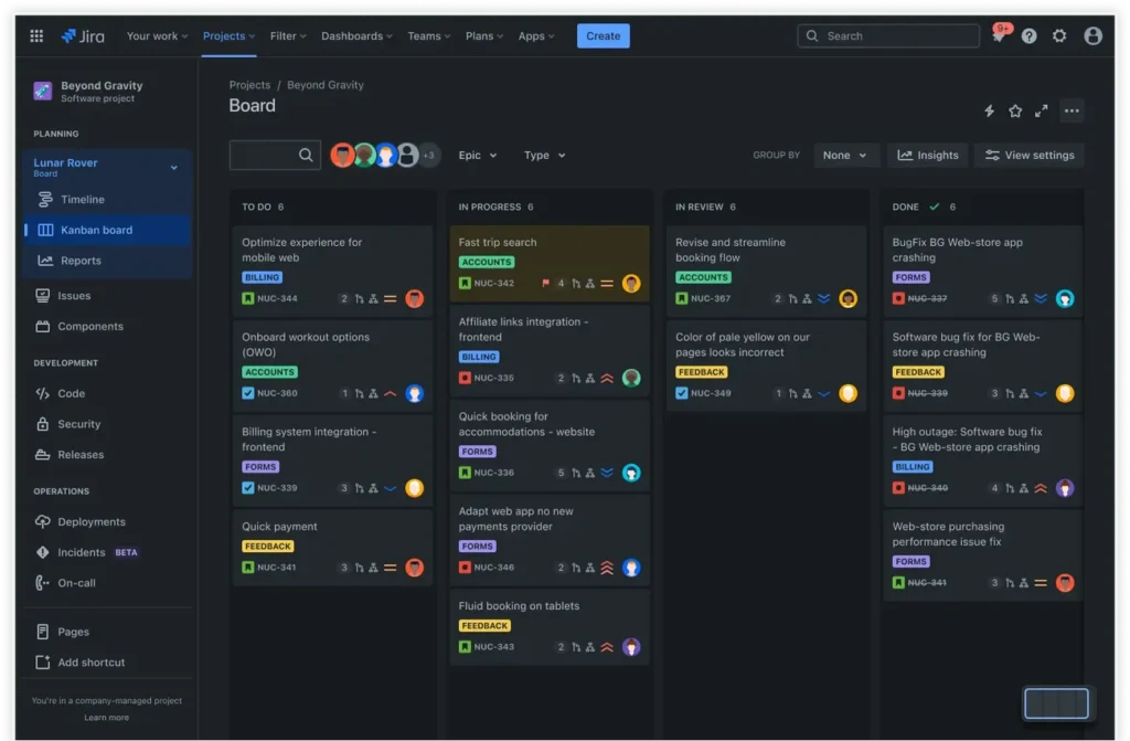
Image Source: Atlassian
Teams need clear task visibility to execute projects well. Task tracker dashboards provide this through centralized monitoring. These dashboards turn scattered tasks into efficient workflows that keep teams in sync and projects moving forward.
Task tracker dashboard metrics
Task tracker dashboards keep an eye on several key project indicators:
- Task ownership and deadlines – Tracks who’s responsible and when deliverables are due
- Milestones and dependencies – Maps connections between related tasks
- Progress tracking – Shows completion percentage for tasks and overall projects
- Priorities and status indicators – Often uses color-coding (RAG: red, amber, green) to highlight urgency
- Resource allocation – Monitors team capacity and workload distribution
These dashboards track task completion times and give a detailed view of project health through customizable views like Kanban boards and Gantt charts.
Task tracker dashboard use case
Project managers use these dashboards to spot bottlenecks early and balance workloads effectively. Teams can focus on high-priority activities while spending less time on administrative tasks thanks to this visual platform.
Task dashboards serve as a central hub where team members access project information and promote transparency and accountability. Team conversations stay with their relevant tasks, which eliminates scattered emails and chat threads.
Task tracker dashboard business impact
Companies that use task tracker dashboards see major operational improvements. A global tech company used dashboards to coordinate teams in multiple time zones and delivered projects 30% faster. Better visibility, fewer manual reports, and clearer priorities drove this improvement.
Task dashboards boost accountability through clear assignments and save time with automated updates. Teams can spot issues early with useful insights. Teams feel less stressed and more motivated because they know exactly where their projects stand.
Project Finance Dashboard

Image Source: Qlik
Project budgets need precise monitoring tools to show financial performance in real time. Project finance dashboards give these insights and help teams track spending against forecasts. Teams can maintain budget discipline with these tools.
Project finance dashboard metrics
Project finance dashboards track these critical financial indicators:
- Budget vs. actual costs – Shows a quick visual comparison of planned against real spending
- Percent complete vs. percent budget spent – Shows progress relative to expenditure
- Forecasted total cost – Projects final expenditure based on current trends
- Status indicators – Often using color coding to visualize budget goal achievement
The dashboard has charts that show projected budget alongside completion percentage. These give a high-level view of project status. Data tables below provide detailed information about cost changes since the original budget planning.
Project finance dashboard use case
Finance departments and project managers use these dashboards to get a detailed view of their project’s financial health. Easy-to-use charts replace complex spreadsheets and reveal spending patterns quickly.
Project teams can examine specific projects when status indicators show budget concerns. Finance departments can find the root causes of overruns and stay informed about project costs.
Project finance dashboard business impact
Organizations using project finance dashboards report better budget management by a lot. Teams can spot unexpected spikes in spending and take immediate action before costs rise further.
Automated reporting cuts out manual data extraction. This saves time and reduces errors. Book your Business Intelligence and Reporting consultation to find how project finance dashboards can change your budget management processes.
These dashboards are sophisticated yet promote transparency. They give all stakeholders access to a single source of financial truth.
Account Growth Dashboard
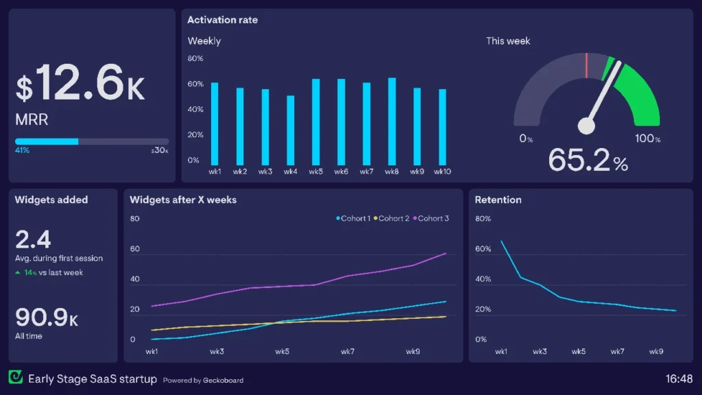
Image Source: Geckoboard
Account expansion dashboards make tracking customer growth patterns easier by showing key metrics and opportunities visually. Teams can monitor existing customer relationships and spot upsell potential with these specialized business intelligence tools.
Account growth dashboard metrics
These dashboards track vital expansion indicators:
- Net Revenue Retention (NRR) – Measures revenue retained and grown from existing customers
- Customer renewal rate – Shows customer loyalty and retention effectiveness
- Customer Lifetime Value (CLTV) – Indicates total expected revenue from customer relationships
- Expansion Revenue Rate – Tracks percentage of revenue growth from existing customers
Account growth dashboard use case
Leaders use these dashboards to track account expansion opportunities and create accountability. These tools turn individual efforts into collective momentum by making progress visible. Teams see direct results of their work instead of just discussing numbers, which promotes ownership in company growth.
Account growth dashboard business impact
Account expansion dashboards do more than just track metrics. These visualization tools show how each team member’s work shapes overall business performance. Employees who were hesitant before often find motivation when they see their tangible contributions. Up-to-the-minute transparency pioneers accountability and helps teams unite around common growth goals.
Inventory Management Dashboard
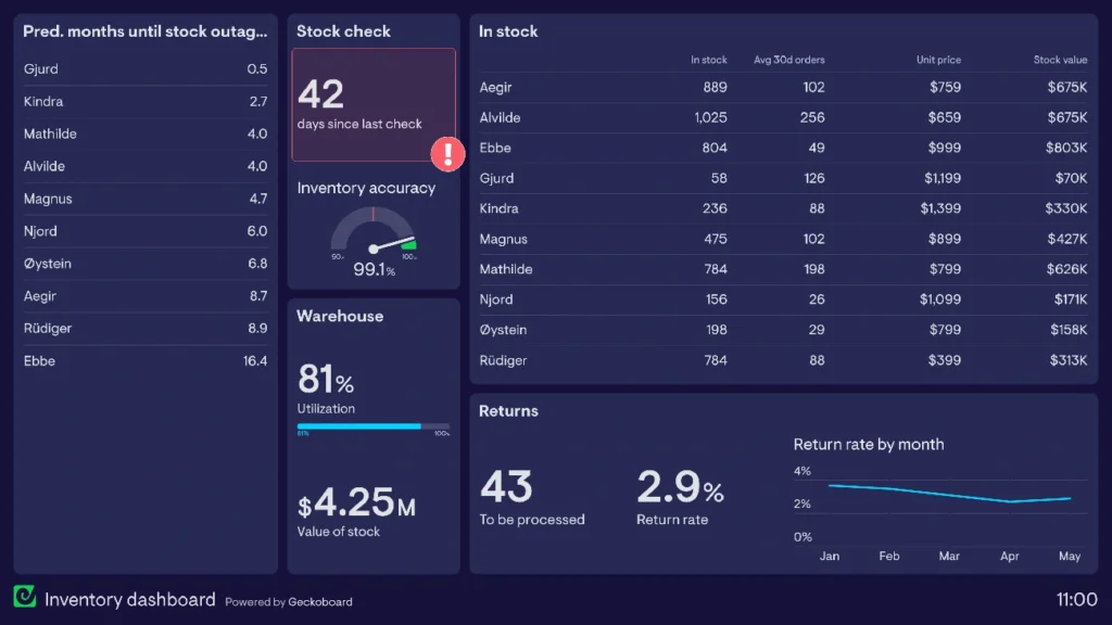
Image Source: Geckoboard
Live inventory tracking is crucial for smooth supply chain management. Inventory dashboards show stock levels instantly and help businesses optimize storage, reduce waste, and deliver orders better.
Inventory dashboard metrics
Good inventory dashboards track these key indicators:
- Inventory turnover – Shows how often stock sells and gets replaced
- Days of inventory outstanding (DIO) – Measures how long items wait before selling
- Stock levels – Tracks current quantities across warehouses
- Days in stock – Shows how long products stay in storage
- Inventory value – Measures total worth of stocked goods
- Obsolete stock percentage – Reveals aging inventory that might not sell
Inventory dashboard use case
Warehouse managers and operations teams use these dashboards to manage product availability and plan orders better. Sales teams across companies use this information to guide customer conversations by promoting well-stocked items or warning about low stock.
Retail staff can give customers better service by checking stock availability on the spot without making them wait. Company executives also rely on these dashboards to spot problems and streamline operations.
Inventory dashboard business impact
Companies that use inventory dashboards see major improvements in operations. These tools help manage cash flow better and cut storage costs by showing clear stock pictures. Live tracking lets companies make informed decisions about stock levels, which prevents expensive stockouts and excess inventory holding.
Smart manufacturers have cut costs by using these dashboards, saving over $250,000 yearly by removing manual work. Hospitals also depend on these dashboards to track crucial medications and supplies.
Survey Analysis Dashboard
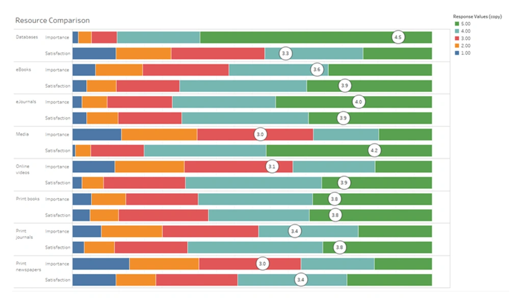
Image Source: Tableau
Survey analysis dashboards make it easy to see feedback data by turning complex responses into useful insights. Organizations can quickly spot hidden patterns in raw data and process customer opinions with these specialized tools.
Survey dashboard metrics
Good survey dashboards track these key indicators:
- Completion rate – Measures percentage of respondents who finish surveys
- Response time – Tracks how long respondents take to complete surveys
- Sentiment analysis – Categorizes feedback as positive, negative, or neutral
- NPS/CSAT/CES scores – Captures customer loyalty and satisfaction metrics
- Question-specific visualizations – Displays appropriate charts based on question types
Survey dashboard use case
Marketing and product teams use these dashboards to turn customer feedback into development priorities. Stakeholders can quickly understand overall sentiment without reading individual comments. The dashboards help companies spot patterns across demographic segments and create individual-specific experiences for different customer groups.
Survey dashboard business impact
Companies that use survey dashboards make better decisions faster. These tools remove the need for manual data processing and save teams valuable time. Teams can quickly spot problems and opportunities by seeing survey results in visual form. Businesses can quickly fix negative feedback before it hurts customer retention through sentiment analysis features. This visual approach turns raw survey data into a valuable asset that improves products and services.
Event Hour Analysis Dashboard
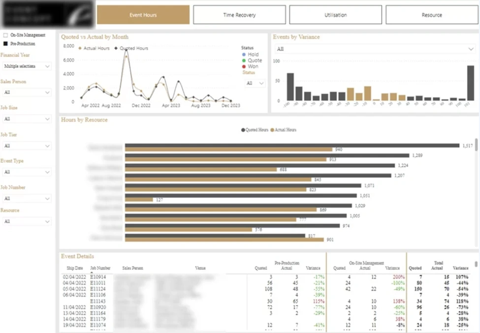
Image Source: Vidi Corp
Event planners face challenges in schedule optimization without reliable attendance data. Event hour analysis dashboards address this problem by showing attendance patterns and engagement metrics. These tools help make informed decisions about timing and resource distribution.
Event hour dashboard metrics
Event hour dashboards monitor several vital indicators:
- Heat maps – Show attendance density across different sessions and times that identify strongest content
- Column/bar graphs – Compare registration numbers year-over-year or across different events
- Pie charts – Display percentage breakdowns of attendee categories or promotional code usage
- Line graphs – Illustrate attendance patterns and revenue trends over time
These visualizations turn complex attendance data into clear patterns. Organizers can spot peak arrival times and popular gathering spots easily.
Event hour dashboard use case
Event coordinators employ these dashboards to optimize scheduling and resource allocation. Immediate analytics let organizers adjust during events. They can promote sessions with low attendance or enhance networking features as needed.
Today’s audience expectations have grown sophisticated. These tools deliver customized experiences by revealing attendee’s content preferences. The dashboards also help staff adjustments when analytics indicate high attendance density.
Event hour dashboard business impact
Organizations using event hour dashboards see notable operational improvements. Event managers learn about attendee movement through integrated data from sensors, cameras, and mobile app tracking. This optimization reduces wait times and ensures smooth transitions between activities.
Predictive analytics forecast attendance patterns before major events, which allows smart resource allocation. The dashboard’s ability to convert complex data into applicable information proves event value to stakeholders. This feature makes these tools invaluable.
Microsoft Planner Dashboard
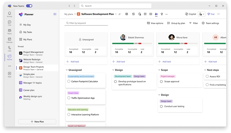
Image Source: Microsoft
Microsoft Teams users can manage tasks better with Planner’s easy-to-use dashboard features. This visual tool helps teams turn scattered tasks into simplified processes through detailed charts and visualizations.
Planner dashboard metrics
Planner dashboards come with four main chart types to track performance:
- Status charts – Display tasks categorized as Not Started, In Progress, Late, and Completed
- Bucket charts – Show task distribution across project categories with color-coded progress indicators
- Priority charts – Organize tasks by urgency levels to ensure high-priority items receive attention
- Assignee charts – Visualize team member workload, making resource allocation transparent
Planner dashboard use case
Project managers use Planner dashboards to balance workloads and spot bottlenecks. Teams can quickly find overdue tasks or check on specific team members through the dashboard’s filter options. Planner works seamlessly with Microsoft Teams and simplifies communication by putting notifications and task management in one place.
Planner dashboard business impact
Companies using Planner dashboards see clear improvements in productivity. To name just one example, a Microsoft Teams project with 70+ team members achieved an impressive 84% task completion rate across 166 tasks. The integration of features like My Day and My Tasks helped team members track their responsibilities immediately and improved their focus by reducing context-switching. Dashboard updates happen automatically, so teams stay on top of project timelines.
Sales Pipeline Dashboard
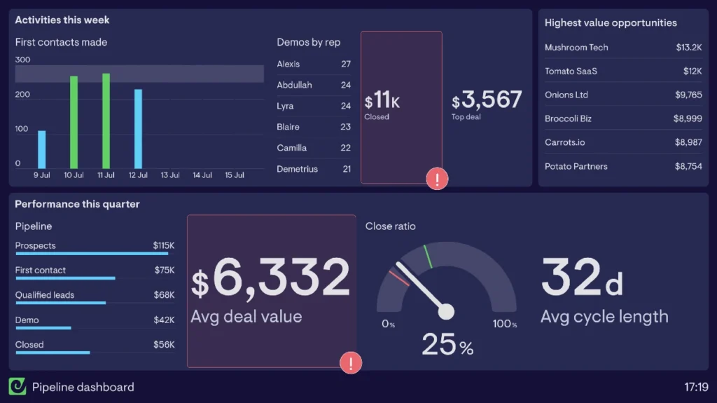
Image Source: Geckoboard
Sales pipeline serves as the best indicator of future revenue, it’s more than just a list of deals. Companies that optimize their pipeline management grow 28% faster than their peers. Clear sales processes help businesses grow revenue 18% faster.
Sales pipeline dashboard metrics
A well-designed pipeline dashboard shows these vital performance indicators:
- Number of deals – The total count of active opportunities
- Average deal size – Shows if teams pursue suitable opportunities
- Sales velocity – The speed at which deals progress through your pipeline
- Stage-by-stage conversion rates – Reveals bottlenecks in your sales process
- Win rate – The percentage of leads that become customers
Sales pipeline dashboard use case
Sales managers rely on these dashboards to see each rep’s pipeline performance, including sales cycles, deal amounts, and conversion rates. The benefits go beyond simple monitoring. Pipeline dashboards help teams forecast revenue with confidence, focus on the right deals at the right time, and identify risks early.
Sales pipeline dashboard business impact
63% of sales managers report their organization struggles with pipeline management. This missed chance matters because effective pipeline dashboards turn scattered data into useful information. These tools help sales teams track deal progress, predict revenue, and spot potential challenges. Companies can then make informed decisions about resources and reduce their sales cycles.
Accounting Power BI Dashboard
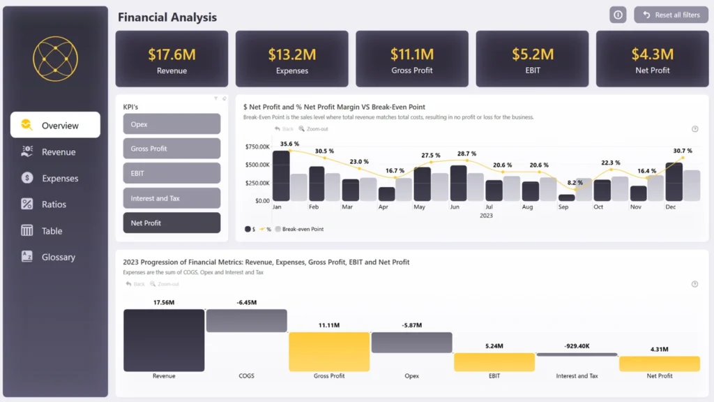
Image Source: ZoomCharts
Power BI has changed how we handle financial reporting by turning complex accounting data into easy-to-understand visuals that help make better decisions. Financial teams now rely on these dashboards that bring multiple data sources together into single views.
Accounting dashboard metrics
Power BI accounting dashboards keep track of these key financial indicators:
- Financial statements – Visualizes balance sheets, income statements, and cash flow reports
- Accounts receivable/payable aging – Tracks outstanding invoices and vendor payments
- Cash conversion cycle – Measures time to convert inventory and receivables into cash
- Profit margins – Displays gross and net profit to assess financial health
- Tax liability tracking – Monitors obligations across different tax categories
Accounting dashboard use case
Finance teams use these dashboards for detailed financial analysis and reporting. Power BI works well with Excel and connects to many data sources. Accountants now use these dashboards to track revenue, analyze expenses, and monitor cash flow with great accuracy. The platform turns static financial statements into interactive, visually appealing reports that update automatically when new data comes in.
Accounting dashboard business impact
Companies that use Power BI accounting dashboards see major improvements in their financial visibility. The tool offers excellent financial data management without limits on reporting volume or complexity. Book your Business Intelligence and Reporting consultation to find out how these dashboards could improve your financial reporting processes. Companies also benefit from better teamwork as finance teams share dashboards securely and work together on analysis and decisions.
Investment Portfolio Dashboard
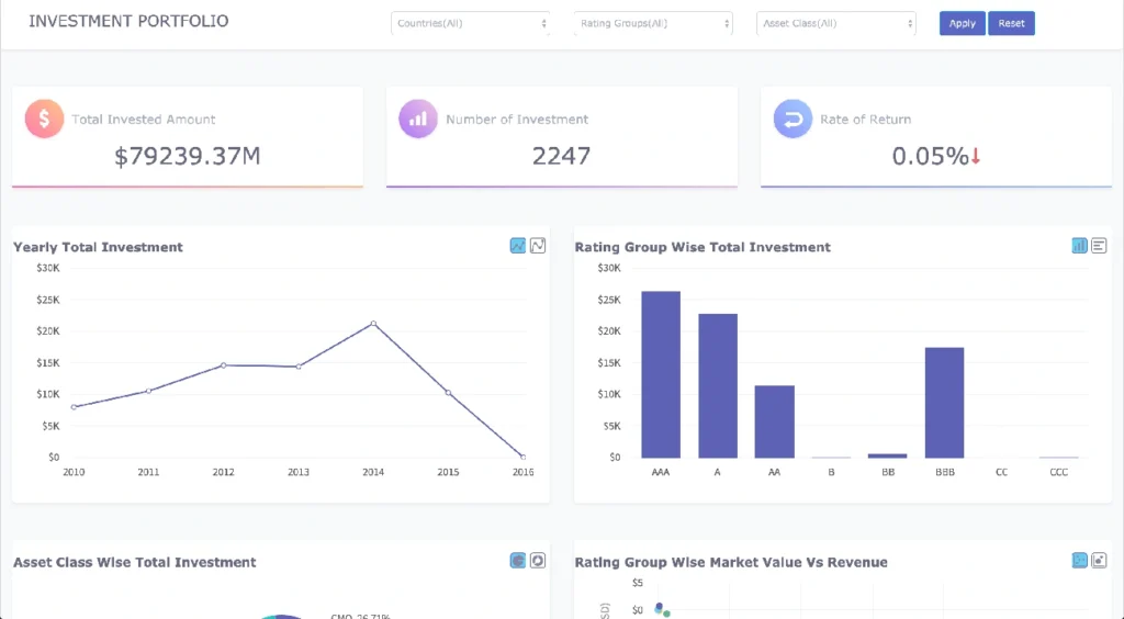
Image Source: Fusioncharts.com
Modern investors need detailed tracking tools to monitor their assets and performance. A resilient investment dashboard gives you clear visibility of your financial holdings from multiple angles.
Investment dashboard metrics
Investment portfolio dashboards track these key financial indicators:
- Rate of return – Measures investment performance over time
- Asset class distribution – Visualizes allocation across different investment types
- Investment concentration – Shows distribution by countries and rating groups
- Yearly investment trends – Tracks patterns in investment amounts
- Portfolio risk – Assesses exposure and potential volatility
These dashboards display performance comparisons, including the top-performing “lazy portfolios” that reached 19.25% YTD returns.
Investment dashboard use case
Financial advisors use these dashboards to track portfolio performance and make allocation decisions. These tools help investors see multiple accounts on one screen and create a combined view of their investments across brokerage, crypto, and retirement accounts.
Investment dashboard business impact
Companies that use investment dashboards gain better financial clarity. Portfolio KPIs guide investment decisions by measuring asset performance, matching results with standards, and evaluating risk exposure. Modern fintech solutions now provide up-to-the-minute data analysis, which leads to faster, informed investment decisions. Tools like Morningstar Direct, Bloomberg Terminal, and Personal Capital feature visual dashboards with customizable alerts.
Comparison Table
| Dashboard Type | Key Metrics Tracked | Main Use Case | Business Effect | Target Users |
| QuickBooks P&L | Total revenue, COGS, Gross profit, Operating expenses, Net income | Financial performance analysis and profitability monitoring | Better decision-making speed and clearer financial understanding | Financial teams, Business owners |
| Cash Flow Power BI | Net cash flow, Cash inflows/outflows, Working capital, Variance analysis | Track liquid assets and spending capacity | Better financial visibility with fewer manual processes | Finance teams, CFOs |
| Sales Analytics | Pipeline health, Quota attainment, Conversion rates, Sales cycle length | Track team performance and spot coaching needs | 80% faster query development, 21% increase in conversion rates | Sales leaders, Representatives |
| Operational Expenses | OpEx, Expenses as % of revenue, Budget vs. actuals, Expense composition | Monitor cost efficiency and budget discipline | Cut energy costs by 50%, better operational efficiency | Finance teams, Executives |
| HubSpot Revenue KPI | Revenue analytics, Deal forecast, MQLs, SQLs, Conversion rates | Track performance and match goals | Better productivity, smoother sales-marketing teamwork | Sales and marketing teams |
| LinkedIn Ads | Impressions, Clicks, CTR, Conversions, Cost metrics | Review campaign success across goals | Connect with 900M+ professionals, better campaign results | Marketing teams |
| Zoom Call Analysis | Call volume, Average hold time, Hour analysis, Meeting quality (MOS Score) | Review virtual events and call performance | Smoother operations, improved customer interactions | Community engagement specialists |
| Task Tracker | Task ownership, Milestones, Progress tracking, Resource allocation | Find bottlenecks and balance workloads | 30% faster project delivery, clear accountability | Project managers |
| Project Finance | Budget vs. actual costs, Percent complete, Forecasted total cost | Compare spending with forecasts | $250,000 yearly savings from automated tasks | Finance departments |
| Account Growth | NRR, Customer renewal rate, CLTV, Expansion Revenue Rate | Find account growth opportunities | Better team accountability and growth tracking | Team leaders |
| Inventory Management | Inventory turnover, DIO, Stock levels, Inventory value | Track product stock and plan orders | Lower storage costs, better cash flow | Operations teams |
| Survey Analysis | Completion rate, Response time, Sentiment analysis, NPS/CSAT/CES | Turn feedback into action items | Quick problem spotting and opportunity finding | Marketing and product teams |
| Event Hour Analysis | Heat maps, Attendance patterns, Revenue trends | Plan schedules and resources better | Shorter wait times, smarter resource use | Event coordinators |
| Microsoft Planner | Status charts, Bucket charts, Priority charts, Assignee charts | Balance work and spot bottlenecks | 84% task completion in large teams | Project managers |
| Sales Pipeline | Number of deals, Average deal size, Sales velocity, Win rate | See rep performance and predict revenue | 28% faster growth with optimized pipeline | Sales managers |
| Accounting Power BI | Financial statements, AR/AP aging, Profit margins, Tax liability | Detailed financial analysis and reporting | Clear financial picture and better teamwork | Finance teams |
| Investment Portfolio | Rate of return, Asset distribution, Investment concentration, Portfolio risk | Monitor portfolio results and allocation choices | Clear financial insights and quick decisions | Financial advisors |
Conclusion
Business dashboards have shown their huge value to organizations of all sizes and industries. This piece showcases 17 dashboard examples that deliver measurable results by turning complex data into clear, applicable information. These powerful visualization tools help teams track everything from financial performance and sales pipelines to inventory management and customer involvement.
Good dashboards share several key features even when they serve different business functions. They present relevant KPIs in easy-to-understand formats. They also let teams monitor significant metrics that shape strategic decisions in real time. Companies can spot trends, identify issues, and grab opportunities faster than competitors who still depend on static reports.
The evidence speaks volumes – organizations using these dashboard solutions see real results. Sales analytics dashboards boost conversion rates by 21%, while task tracking systems deliver projects 30% faster. Financial dashboards give unprecedented visibility into cash flow and profitability. Marketing dashboards turn campaign data into ROI-focused strategies.
Data visualization leads modern business intelligence. Your company’s success depends on how quickly you understand performance indicators and respond to market changes. Dashboards offer insights instantly instead of making you wait for quarterly reports. The comparison table above helps you pick dashboards that match your organization’s needs.
Starting data-driven decision-making needs the right visualization tools for your specific business challenges. Pick one or two key areas where better visibility would help your bottom line most. Success in these areas will help you grow your dashboard system naturally. Before choosing any solution, Book your Business Intelligence and Reporting consultation to make sure your dashboard strategy fits your business goals and technical needs perfectly.
Setting up detailed dashboards might seem daunting at first. The competitive edge you gain through better visibility, faster decisions, and boosted efficiency makes it worth the original investment. These advantages will help your organization grow steadily in 2025 and beyond.
Key Takeaways
These 17 proven dashboard examples demonstrate how visual data transforms business performance across every department, from finance to marketing to operations.
• Choose dashboards based on impact: Start with 1-2 high-priority areas where visibility directly affects your bottom line
• Real-time insights drive results: Organizations report 21% higher conversion rates and 30% faster project delivery with proper dashboards
• Visual data beats static reports: Dashboards transform complex metrics into actionable insights that enable faster decision-making
• Integration amplifies value: Connect multiple data sources for unified views that eliminate silos between departments • ROI comes from implementation: Companies save up to $250,000 annually by replacing manual processes with automated dashboard reporting
The competitive advantage lies not in having data, but in visualizing it effectively to spot trends, identify issues, and capitalize on opportunities before competitors do.
FAQs
Q1. What are the key benefits of using business dashboards? Business dashboards provide real-time insights, transform complex data into actionable visuals, enable faster decision-making, and help identify trends and issues quickly. They can lead to improved operational efficiency, increased sales conversions, and better financial management across various business functions.
Q2. How do I choose the right dashboard for my business? Select dashboards based on your specific business needs and priorities. Start with 1-2 high-impact areas where increased visibility would most benefit your bottom line. Consider factors like the key metrics you need to track, the primary users of the dashboard, and how it integrates with your existing systems.
Q3. Can dashboards really improve business performance? Yes, dashboards can significantly improve business performance. Organizations have reported tangible benefits such as 21% higher conversion rates with sales analytics dashboards and 30% faster project delivery through task tracking systems. Dashboards enable data-driven decision-making and help businesses respond quickly to changing market conditions.
Q4. What are some common metrics tracked in business dashboards? Common metrics tracked in business dashboards include revenue, expenses, profit margins, sales pipeline health, conversion rates, customer satisfaction scores, inventory levels, and project progress. The specific metrics depend on the type of dashboard and business function it serves.
Q5. How often should I update my business dashboards? Many modern business dashboards offer real-time or near-real-time updates, pulling data automatically from various sources. However, the ideal update frequency depends on your business needs and the nature of the data. Critical operational metrics might require constant updates, while strategic indicators could be refreshed daily or weekly. Regular review and refinement of your dashboards ensure they remain relevant and valuable.